Component and Template
Components are re-usable modules that implement specific application logic to render the content of our website.
A Template is used to create a Page and defines which components can be used within the selected scope. A template is a hierarchy of nodes that has the same structure as the page to be created, but without any actual content.
Interview Questions
Note: More on creating the Components watch this
| dialog | design-dialog |
|---|---|
| Dialog will change the content at the page level. | Design dialog will change the content at the template level. |
| authored in edit mode. | authored in design mode. |
| node name should be dialog. | node name should be design_dialog. |
| stored under pages jcr:content node. | stored under design page located under /etc/design/default. |
| we can get value from properties object. | we can get design dialog value from currentStyle object. |
| jcr:primaryType is cq:Dialog. | jcr:primaryType is cq:Dialog. |
cq:dialog - It is the dialogs for the touch-optimized UI(editor.html).
- It uses the Granite UI framework.
- Node name is cq:dialog.
- jcr:primaryType = nt:unstructured, sling:resourceType = cq/gui/components/authoring/dialog for cq:dialog
parsys – It is a placeholder called “Paragraph System”, where we can drag and drop or add other components or scripts at page level.
iparsys - The inherited paragraph system is a paragraph system that also allows you to inherit the created paragraphs from the parent. it is similar to parsys except that it allows to inherits parent page “paragraph system” at template level. You can also cancel paragraph inheritance at a level at any time. It has two checkbox options to cancel/disable the inheritance.
- Cancel Inheritance - If selected, the components in this paragraph system are not passed down to the child pages.
- Disable Inheritance - If selected, components of this paragraph system on this page are not inherited from the parent page.
Overlaying - The intention of overlaying a default component is to alter the appearance or behavior of a component globally, for all relative references to the component. It relies on the nature of sling to resolve to the /apps folder before searching in the /libs folder. Thus the path to the component is identical to the path to the default component, except it is in the /apps folder and not the /libs folder. More on overlaying watch this video
Creating a custom component manually by creating all necessary nodes and setting value of “sling:superResourceType” property as “/libs/foundation/components/image”. By doing this you inherit all the feature of image component, even after upgrade you still inherit the features of image component. For more information watch this video
The JSP script file global.jsp is used to provide quick access to specific objects (i.e. to access content) to any JSP script file used to render a component. Therefore global.jsp should be included in every component rendering JSP script where one or more of the objects provided in global.jsp are used.
For more information Check this linkThe edit behaviour of a component is configured by adding a cq:editConfig node of type cq:EditConfig below the component node (of type cq:Component) and by adding specific properties and child nodes.
For more information check this linkParbase is a key component as it allows components to inherit attributes from other components, similar to subclasses in object oriented languages such as Java, C++, and so on. For example, when you open the /libs/foundation/components/text node in the CRXDE Lite, you see that it has a property named sling:resourceSuperType, which references the parbase component. The parbase here defines tree scripts to render images, titles, and so on, so that all components subclassed from this parbase can use this script.
Users do not need access to the parbase.
sling:resourceSuperType: It is used to achieve inheritance in cq. When set, it inherits the specified component to this component.
sling:resourceType: It is a path, which locates the script to be used for rendering the content. Path used can be absolute or relative.
We can have listeners node under dialog/widget in AEM component. Listeners is nt:unstructured type node. We can add event(like loadcontent, focus etc) as property into listeners node. Example
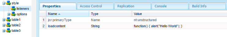
Listeners will trigger loadcontent event and show "Hello World" in popup.
sling:include - This is the include tag of the Sling JSP Tag library. This tag knows about Sling and also supportsRequestDispatcherOptions.
cq:include - This tag is Communiqué specific extension of the Sling JSP Tag library include tag. IIRC it supports callings scripts in addition to just including renderings of resources.
c:import - I assume this is the import tag of the Standard Tag Library. This tag is documented at http://java.sun.com/products/jsp/jstl/1.1/docs/tlddocs/c/import.html and does not know about Sling directly.
But -- asuming -- this tag is using a RequestDispatcher to dispatch the request, this tag will also pass Sling and the Sling resource resolver.
In Sightly -
< div data-sly-resource="${@path='mycomponent', resourceType='foundation/components/mycomponent'}">
In JSP -
< cq:include path="mycomponent" resourceType="foundation/components/mycomponent" />
There are two categories of node types, primary and mixin. Every node has a primary node type assigned to it upon creation. In addition, a mixin node type may be added to a node later in its lifecycle.
The primary node type of a node usually defines node structure (i.e., allowed and required child nodes and properties) related to the problem domain being modeled. For example, a node used in storing content about business contacts might have the primary type myapp:Contact which defines properties such as myapp:givenName, myapp:familyName and so forth.
Mixin node types usually specify additional properties or child nodes related to a capability being added to the node. These capabilities may include generic repository-level functions as in the case of the built-in mixins mix:versionable and mix:lockable, for example, or domain-level capabilities such as a (hypothetical) myapp:Emailable mixin type that adds the property myapp:emailAddress to a node.
init.jsp should be included in our jsp or script file to display sidekick.
Note:- We should include init.jsp into base page. So that it will appear in all pages which are overriding it.
For more on sidekick watch this videowidget - Adobe Experience Manager (AEM) uses the ExtJS widgets library, which provides the highly polished user interface elements that work across all the most important browsers and allow the creation of desktop-grade UI experiences. These widgets are included within AEM and, in addition to being used by AEM itself, can be used by any website built using AEM. For more on widgets check this link
xtype - In the ExtJS language, an xtype is a symbolic name given to a class. For more on xtype check this link
Dropdown list, Checkbox and Radio button have same xtype i.e selection. But they have different type select, checkbox and radio respectively.
allowedPaths - Path of a page that is allowed to be based on this template.
allowedChildren - Path of a template that is allowed to be a child of this template.
allowedParents - Path of a template that is allowed to be a parent of this template.
ranking - Rank of the template. Used to display the template in the User Interface.
There will be no effect on the page because when page will be requested it will check the sling:resourcetype property of the page not the template. Check sling resolution concept
componentGroup - Group under which the component can be selected in the Sidekick.
cq:isContainer - Checks if this component is a container component. For example a paragraph system component.
cq:noDecoration - If true, the component is not rendered with automatically generated div and css classes.
Add componentGroup property in component. In componentGroup property add .hidden as a value.
Suppose We have component A and component B
In component A, added sling:resourceType property and as value component B path
when you include the component A into the page, AEM will render component A
But when you drag and drop component A into parsys of the page, AEM will render component B
Sling framework bundle (org.apache.sling.resourcemerger) gives us flexibility to have merged view on multiple other resources. The exact merging mechanism depends on the resource picker implementation (i.e. Overlay or Override).
By this Sling Resource Merger, It is possible to
- 1. remove existing resource/properties from the underlying resources,
- 2. modify existing properties/child resources of the underlying resources
- 3. add new properties/child resources
- 1. sling:hideProperties (String or String[]) — Specifies the property, or list of properties, to hide.The wildcard * hides all.
- 2. sling:hideResource (Boolean) — Indicates whether the resources should be completely hidden, including its children.
- 3. sling:hideChildren (String or String[]) — Contains the child node, or list of child nodes, to hide. The properties of the node will be maintained. The wildcard * hides all.
- 4. sling:orderBefore (String) — Contains the name of the sibling node that the current node should be positioned in front of.
- ensure that customization changes are not made in /libs.
- reduce the structure that is replicated from /libs. more
If we have mycomponent.jsp, mycomponent.html and mycomponent.html.html under mycomponent component. AEM will render mycomponent.html.html file.
If we have mycomponent.jsp and mycomponent.html under mycomponent component. AEM will render mycomponent.html file.
A specific widget with the label cqinclude exists which allows for inclusion of existing dialog elements in other dialog definitions. The generic JSON format is used on the client side to construct the actual dialog. Following is an example which uses the cqinclude widget to include an existing tab from an existing dialog:
"jcr:primaryType": "cq:Widget",
"xtype": "cqinclude",
"path": "/libs/replication/components/agent/tab_extended.infinity.json"
}
The path property needs to point to a dialog-resource that is to be included in JSON format.
Yes, we can create a page without using template in AEM.
Set a property in component B called sling:resourceSuperType with the path to component A and omit the default script in component B
27. You want to create a custom widget. In which type of folder should you create the custom widget?
Create a folder under your project folder in /apps with the nodeType = cq:ClientLibraryFolder and set property sling:resourceType = widgets/clientlib
Create and configure the /cq:editConfig/cq:inplaceEditing node under the component node.
Copy the page properties dialog from the foundation/page component, add a new tab node specifying the cq:Panel node to render the new tab.
cq:allowedTemplates
No, tempB needs to be added to the property cq:allowedTemplates of pageA to accomplish that.
WCMMode.fromRequest(request);
With scaffolding we can create a form (a scaffold) with fields that reflect the structure we want for our pages and then use this form to easily create pages based on this structure.
Note: More on Scaffolding watch this video